.png)
KRIS is a secure document management system (DMS) designed by SQL View to help businesses manage critical documents while ensuring compliance with regulations. One key feature is Smart Mail Organizer (SMO), a plugin whereby users can easily save emails and attachments from Outlook to KRIS.
While KRIS and SMO provide robust functionality, the error messages across the platform lacked consistency and clarity. Overly technical messages led to user confusion, frequent support escalations, and inefficiencies for both users and internal teams.
This project aimed to redesign error handling across KRIS, starting with SMO. The goal was to create a scalable error management framework that empowered users with clear, actionable guidance while establishing reusable components integrated into KRIS’s design system.
Redesigning error management
Role
Lead Product Designer
Responsibilities
UX Design, Visual Design, UX Writing, Design System, Project Management, Prototyping, Usability Testing
Team
Product Manager, 2 Customer Success Specialists, 3 Developers, 2 QA Engineers, Product Designer
Timeline
4 months
Platform
Web, Outlook
Research and Audit
Mapping the Current State
-
Collaborated with developers to extract the first 170 error messages logged within Smart Mail Organizer (SMO)
Organised error message by feature: Filing, Login, Treeview, Rest, and Search
-
Evaluated each message based on:
-
Clarity: Is the message understandable for non-technical users?
-
Actionability: Does the message guide users toward resolution?
-
Tone: Does the message feel intimidating or reassuring?
-
Findings
Out of 170 error messages, we found that:
92 lacked actionable steps
48 were overly technical - where a normal user would not be able to comprehend
Centralised Documentation
Created a centralised error message database including:
Reason for occurrence: human/technical
Original message text
Chance of occurrence: Very common, common, rare, very rare, unsure
Severity level: low, medium, high
Suggested improvements (language, action, tone)

Categorisation and Analysis

Based on the audit findings, we developed a severity-based categorization system.
Problems
Managing error messages may seem straightforward, but for KRIS and SMO, it was a significant challenge that directly impacted user experience and business operations:
User Confusion and Escalations
Overly technical messages, such as “Base64 can not be null or empty,” left users uncertain about next steps. Many users escalated even minor issues to Customer Support, increasing ticket volumes unnecessarily.
Overload on Customer Support
Users often failed to provide sufficient context when reporting errors, forcing the support team to spend valuable time in understanding the context — analysing logs, asking follow-up questions — before they could even begin resolving the problem.
The inefficiency caused frustration on both sides: users felt unsupported, and the support team was overwhelmed with repetitive, preventable escalations.
Inconsistency Error Handling Across Modules
Error messages lacked standardisation in tone, structure, and guidance. This inconsistency confused users and undermined trust in the platform.
Scalability Challenges
Without a reusable framework, error messages were designed ad-hoc, leading to inefficiencies in implementation and inconsistency across features.
"How might we redesign error handling to empower users while creating a scalable framework that ensures consistency across SMO?"

Use this space to promote the business, its products or its services.
Use this space to promote the business, its products or its services.
Solution
We introduce a framework to determine how the error message should be displayed, with responses tailored according to severity levels.
Thereafter, we revamped the user experience with error message handling by redesigning the error message content, the workflow that users can take to resolve these errors, and the way these errors were conveyed to the users.
Designing the solution
The redesign involved rewriting all 170 error messages while focusing on priority errors for earlier releases. Key elements included:
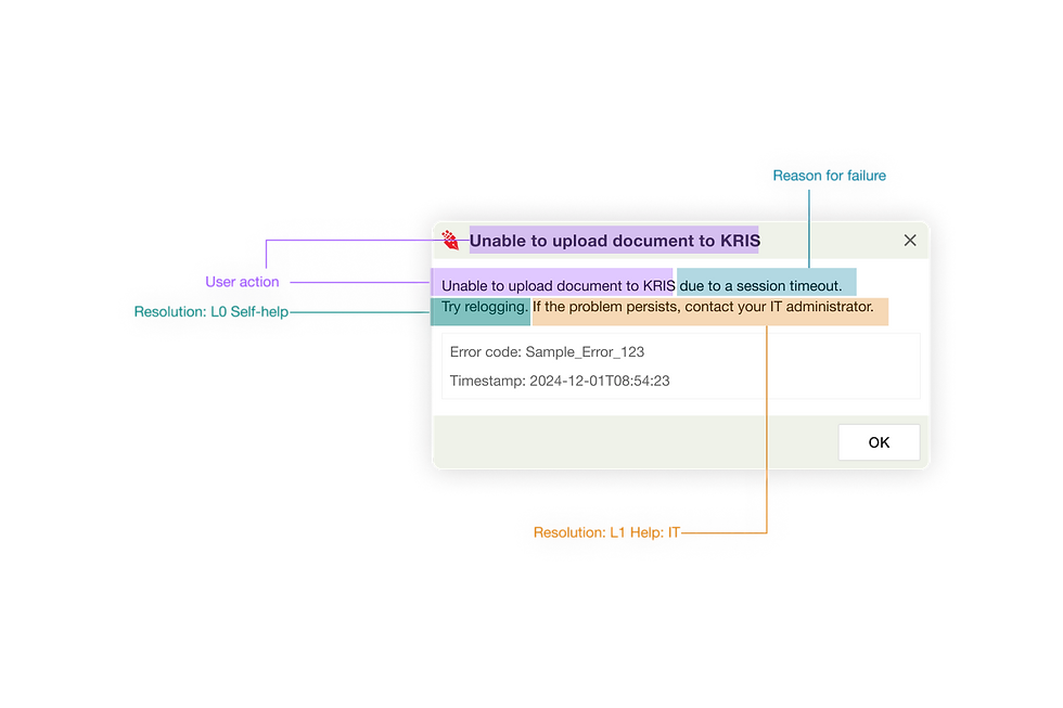
1. Simplified Content
Replacing technical jargon with user-friendly language
2. Guided Workflows
Include error code and timestamp for troubleshooting
3. Dynamic Messaging
Displaying relevant guidance based on user role or context
Impact
Team alignment and mindset change
This project set the foundation for a culture shift, emphasizing the importance of error management and its impact on user experience and support efficiency. If implemented, the redesign is expected to reduce the number of tickets by 20-30% for low-priority issues.
Kickstarting Phase 2
The framework now serves as a template for error management across all KRIS modules, reducing future design and development time.
Takeaways

Proper documentation isn’t just an operational tool
It is an enabler of cross-functional alignment. Error management is everyone’s responsibility, be it the Customer Success, Developers, or Designers.

Stakeholder management
Certainly, it is not easy to get everyone’s full involvement, there needs to be some convincing that this can make their own job easier in the long term. As a designer, influencing stakeholders requires empathy, clear communication, and showing the long-term value of proposed changes.

Scoping for Scalability
Focusing on a foundational MVP lays the groundwork for a scalable design system.
Credit illustrations to Storeyset
Challenges addressed
1. Stakeholder Buy-In
Developers initially resisted additional documentation, but aligning error management goals with reduced support tickets secured their commitment.
2. Technical Constraints
As SMO is an Outlook plugin, certain design capabilities were limited, requiring creative compromises.