Yzel is a curated platform designed by Commercehulk to help consumers discover independent brands effortlessly. Amidst the e-commerce surge during the COVID-19 pandemic, we identified a gap: consumers struggled to find unique indie brands without tedious searches. Yzel addresses this by offering a seamless exploration experience.
Streamlining the experience to discover indie brands
Role
Lead Product Designer
Responsibilities
End-to-end UX: User Research, Competitive Analysis, Ideation, UX Design, Prototyping, Usability Testing
Team
Co-Founder, Marketing Executive, 2 Developers, Product Designer
Timeline
4 months
Methodology
UX Design Thinking - Empathise, Define, Ideate, Prototype, Test
Platform
Web: Desktop, Tablet, Mobile

Problems
In 2020, the COVID-19 pandemic slowed down most economic activities. However, it accelerated the exponential growth of the e-commerce market. The global B2C e-commerce market size was valued at USD 3.67 trillion, with Asia Pacific accounting for USD 1.35 trillion, and was expected to expand at a compound annual growth rate (CAGR) of 9.7% from 2021 to 2028. My co-founder and I took this opportunity to dive deep into this industry, in search of a potential market gap.
Despite the exponential growth of e-commerce, discovering unique indie brands remained cumbersome. Consumers faced these challenges, leading to a frustrating shopping experience, deterring consumers from engaging with independent brands.
Tedious discovery processes involving extensive searches and multiple open tabs
Difficulty verifying the legitimacy of brands and their products
Challenges in recalling previously researched brands of interest

User Testing and Iterations
To validate our designs, we conducted user testing with 20 individuals through both in-person and online sessions. Their feedback highlighted areas for improvement, such as navigation visibility and symbol clarity.
Based on this input, we made key adjustments:
-
Kept navigation arrows permanently visible.
-
Removed ambiguous symbols (e.g., dollar signs) to improve clarity
-
Added category-based search functionality to refine user results.
These iterations ensured that the platform aligned with user needs and expectations.


Solution
To enhance the customer experience, we developed Yzel with features tailored to address these pain points:
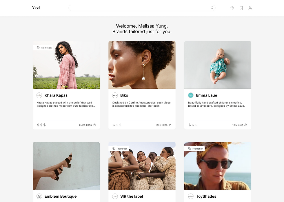
Tailored Brand Discovery
Personalised recommendations based on user preferences to simplify the exploration process
Authentic Reviews
Incorporated genuine customer feedback to build trust and verify brand legitimacy.
Favourites Functionality
Enabled users to save and easily revisit brands of interest, streamlining future interactions
Impact
The Yzel website was ready for the public on end November of the same year.
Over the three months period, there were 1100 users and 125 returning users.
We managed to capture the basic demographics of the returning users that constitutes to 11% retention rate, which validated our target audience of female users.
Ideation and Prototyping

Coming together as a team, we started by brainstorming what would define a "better experience" for users. Using post-it notes, we categorised key attributes into three pillars: better experience, credibility, and managing favourites.
This helped us prioritise features and align on what a successful user experience should look like.

To ensure a seamless experience for end users, we also considered how brands would interact with the platform. Brands play a crucial role in populating the platform with content, and their ability to structure information directly impacts how users discover and engage with indie brands.
We developed an Information Architecture diagram from the perspective of a brand to define how brand-side features—like traffic monitoring, and profile management—would align with user discovery needs.

Next, we created a user flow to map the journey from landing on the platform to discovering and saving brands. This flow ensured that every interaction was intuitive and aligned with user expectations.

Once the flow was finalised, I translated these ideas into low-fidelity wireframes, focusing on key features like personalised recommendations, authentic reviews, and a favourites function.
These prototypes served as the foundation for refining the user experience. They also became the blueprint for the next phase, where we tested and refined the designs based on user feedback.
Research and Analysis
To deeply understand the challenges of indie brand discovery, we began analysing competitors within the e-commerce landscape. We discovered that credibility of the merchants and their products are dependent on the nature of merchants themselves.
Even though there are indie brands of varying sizes on Lazada, Shopee and Zalora, there is no major marketplace dedicated to indie brands.


Additionally, we conducted user interviews to gain insights into consumer behaviours and frustrations with the current discovery process. From these efforts, we identified key pain points and developed proto-personas representing our target users — primarily affluent, fashion-focused females aged 17-34 — who value:
-
authenticity,
-
ease of discovery, and
-
trustworthiness in their shopping experiences.

Takeaways

Design can be a messy process, but practice brings improvement
Design can be a messy process, but practice brings improvement
While there is a methodology to follow, it only serves as a guide. The design process often requires flexibility to navigate unexpected challenges. One key takeaway was the importance of prioritising user research. Due to time constraints, we had to expedite the consumer understanding phase, which highlighted the need for better planning and resource allocation in future projects.
Some practices were omitted or not fully implemented during this project, which required us to revisit earlier phases for refinement. This highlights the importance of incorporating key practices early on to avoid rework. These challenges reinforced that design is a continuous learning process, and I’m confident the lessons from this project will shape stronger outcomes in the future.
Credit illustrations to Storeyset
Implementation and Challenges
After designing, we realised our team lacked the technical capability to develop a platform addressing all pain points. To move forward, we defined an Minimum Viable Product (MVP) to test the fundamentals of our idea—whether people would explore and trust a website showcasing indie brands. We reassessed our proposed solutions based on effort required versus impact created and selected features that solved key pain points with minimal effort and maximum impact.
In the revised MVP, users could visit the website without creating an account to reduce abandonment. Core features were scheduled for progressive addition according to our roadmap.
The design handoff was challenging initially, as I had limited knowledge of HTML/CSS, and the developers were also new to web design. Through constant communication, we adopted an agile approach, breaking features into bite-sized tasks with weekly check-ins. Progress and changes were documented in Google Docs, which streamlined our first attempt at a structured handoff process.
